EHA reaffirms commitment to hematology's future with new brand identity

The European Hematology Association (EHA) is thrilled to announce the launch of our new brand identity. This includes a refreshed logo, updated color palette, and a new slogan, marking a significant milestone in our journey. This rebrand reflects our commitment to innovation, member satisfaction, and increased impact.
A future-ready organization
Over the past two years, EHA has undergone a remarkable transformation, positioning itself as a future-ready organization dedicated to the European hematology community.
By fostering a global network of professionals and facilitating seamless sharing of knowledge, EHA is consolidating its role as a catalyst for innovative ideas and lasting relationships.
Through our expansive community of 7,972 members from over 152 countries, EHA’s continued professional development programs, meetings, and Annual Congress ensure a streamlined exchange of research and best clinical practice, ultimately enhancing the impact of hematology research and clinical care in Europe and beyond.
We have developed a new identity to reflect this transformation, and to underline our focus on building a thriving community that drives societal progress.
Our new identity

Our new identity is rooted in our values as an organization, which are:
- Global connection
- Purpose
- Collaboration
- Inclusion
- Network
- Passion
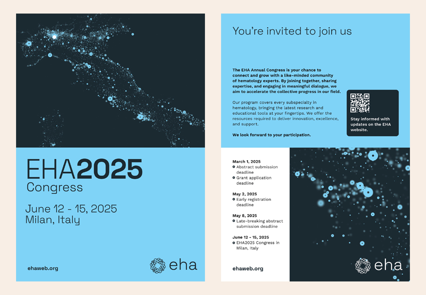
From today, our new brand colors, graphics, and typography are being rolled out across our website, social media, and all member touchpoints.
While our look is changing, our dedication to our core values and mission remains steadfast. Our new brand identity mirrors our dynamic and distinctive nature, inspiring everyone within our community.
Our new logo

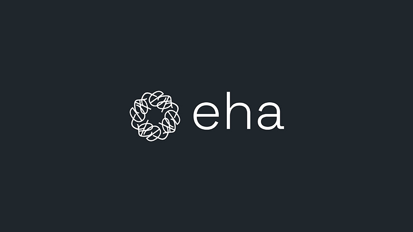
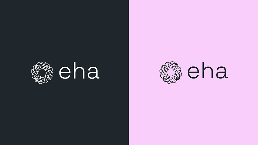
The new EHA logo consists of a symbol and wordmark.
The new symbol is an abstract hemoglobin protein. Hemoglobin is essential to life, and its dynamic structure represents the vital processes happening within us every moment. Inspired by this incredible molecule, our design team took a microscopic look at hemoglobin and saw the beauty and complexity of its form. They used this inspiration to reimagine our logo, integrating the ‘E,’ ‘H,’ and ‘A’ to craft a symbol that embodies both vitality and innovation.
Our new logo is therefore more than just a design; it’s a tribute to the life-giving power of blood and a reflection of our commitment to pioneering advancements in clinical hematology.
The logo also has an animated version, which gives the feeling of constant evolution and reinforces the importance of connection and collaboration to our work.
Our refreshed website
You may notice that our website looks different, with new colors, fonts, and images. However, it is still the same site you know and trust—just with a refreshed look and feel.
We are currently in the process of developing a completely new website that will improve our online presence and offer our visitors a better user experience. We will share more on this in the near future.
Next steps
Stay tuned for more updates and be sure to check our website and social media channels today for the official reveal. As we reaffirm our commitment to the hematology community and the future, we will continue pursuing our shared purpose: to transcend barriers and to achieve ‘Borderless Hematology.’


 Back
Back